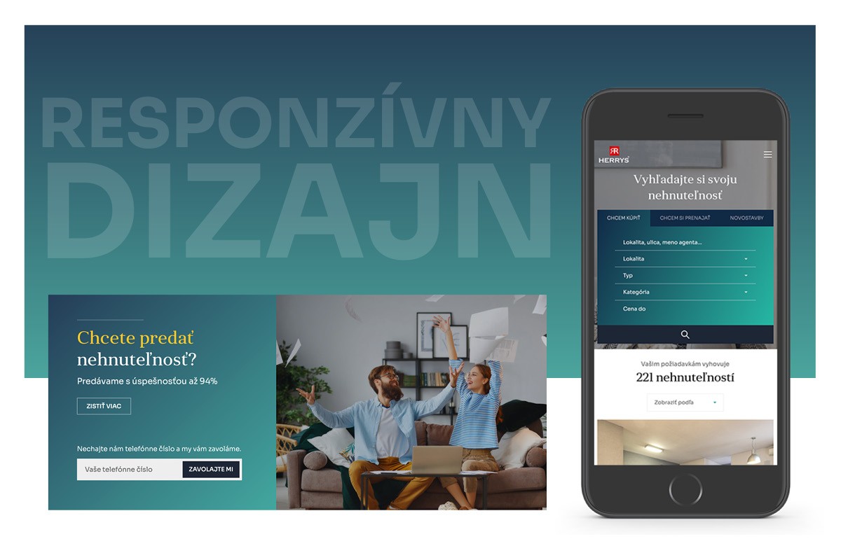
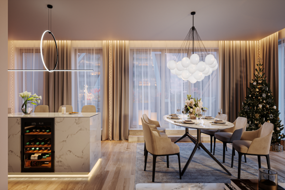
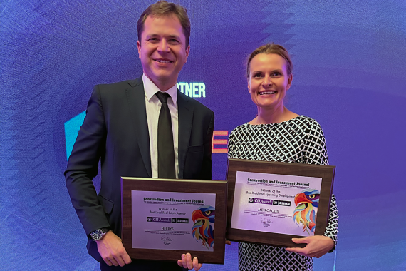
Herrys, a real estate agency focused on the sale of residential real estate in Bratislava and its surroundings, informs about the latest redesign of its website www.herrys.sk. The aim of the redesign was to streamline the access of site visitors to information that helps them make the right decisions in real estate transactions. The result of great design work is an aesthetically appealing look of the site and a more attractive environment for users. The change also affected the overall visual identity of the company.
The herrys.sk website is one of the basic communication and business channels of a real estate agency. Over the past twelve months, it has been visited by 275,000 unique visitors. In addition to the daily updated offer of the real estate agency, they also found practical information, legal or mortgage advice, as well as quarterly market surveys. The new website has a user-friendly efficient UX&UI design and layout is created in the trendy style of the magazine.
"Thanks to the herrys.sk website, more than 8000 of our clients have found their homes. Every two years we implemented a regular design facelift of the site. We decided to use both of the pandemic periods for its complete redesign. We wanted it to be more technologically efficient and visually appealing. The challenge was to bring something new, to stand out from the traditional look of real estate sites, and to give it a clean and more modern look. That's why we chose the layout in an attractive magazine style," says Katarína Žoldák Kupcová from RK Herrys.
When asked how long the programming took, Katarína Žoldák Kupcová answered: “We spent several months programming, we analyzed and tested the user behavior of the respondents on a daily basis. We would like us to get a user-friendly environment where those interested can comfortably choose their property. I believe that visitors liked the new website and will be happy to return to it."
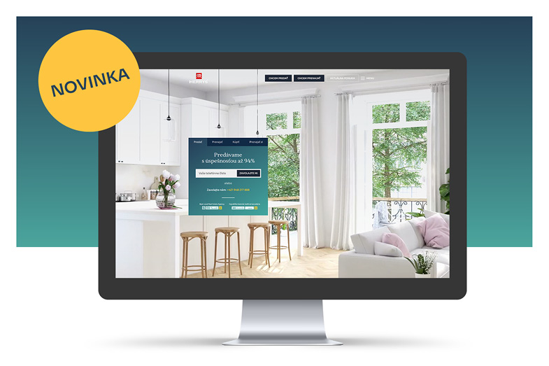
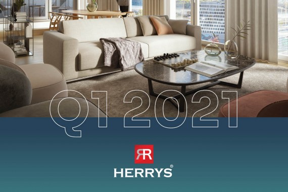
In addition to membership, the right choice of a pleasant color scheme is important for website design. "We used the theory of color in web design. We wanted the site to have a professional look and inspire confidence, so we chose the dominant sophisticated darker turquoise. It radiates peace of blue and green energy. Turquoise is a friendly and happy color, it helps to think clearly, it expresses wisdom, tradition, fidelity and prosperity," adds Katarína.
For regular monitoring of current events on the real estate market in Bratislava and its surroundings, RK Herrys recommends that visitors subscribe to receive an updated electronic newsletter on their website. On the "For developers" subpage, it provides office information on a wide range of real estate development services, including initial market and demand research, marketing support design and sales strategies, project management, as well as consultations on project supplier selection.

